Spring Summer 2017 Inspirational Mood Board Review
I'm working on a new seasonal moodboard this week, which means taking down the old moodboard that's carried Suite One Studio halfway through this year. I thought it'd be fun to share a recap of the major design takeaways I noticed while packing up the previous season's inspiration images. It's funny, this board has been hanging over my desk since late last year, but once everything was pulled down and disassembled, the randomness of the images became less noticeable. Instead, there were very clear themes and colors repeated throughout!
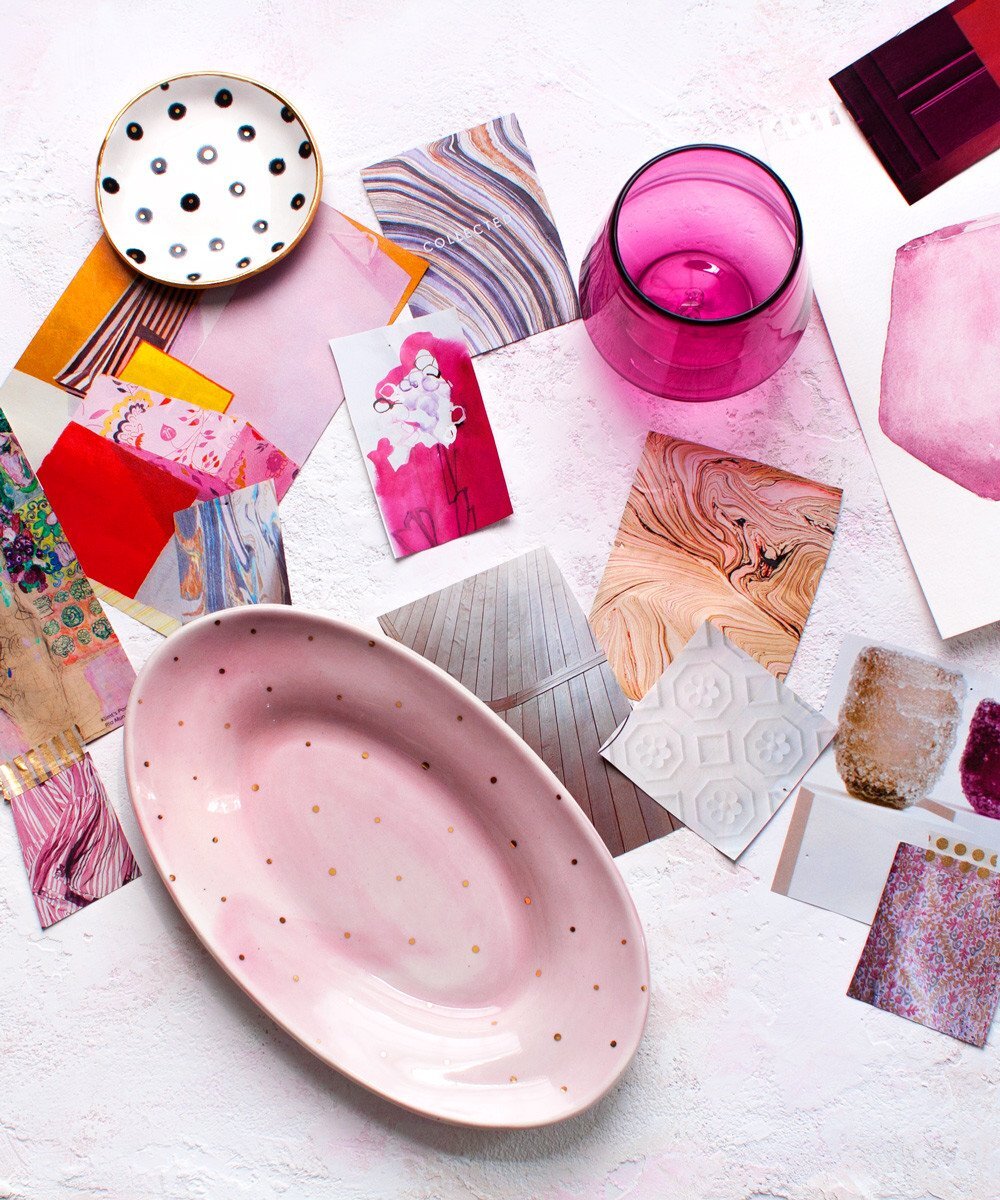
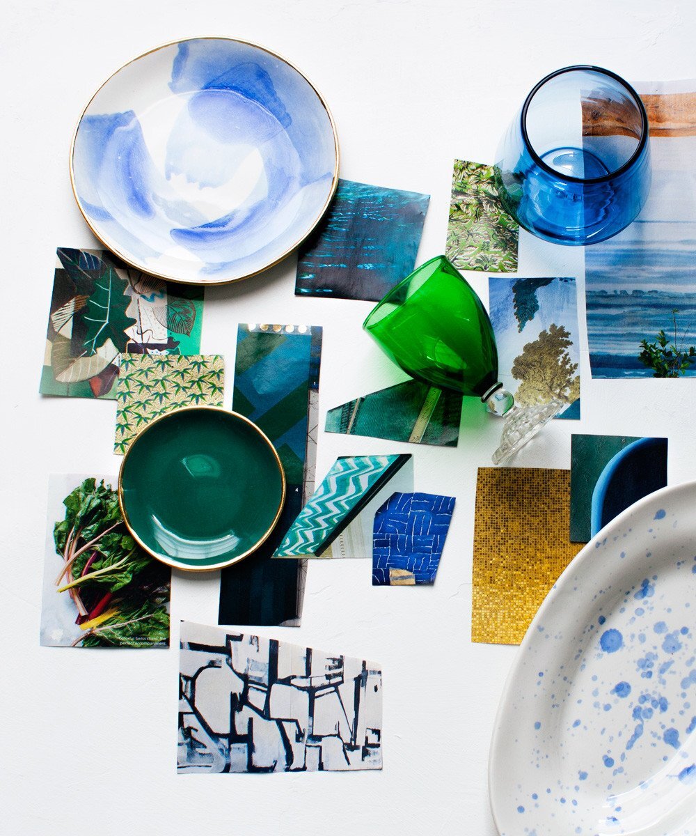
Three major color categories emerged: Deep, cool pinks; Vivid blue-greens; and tone on tone neutrals.
Pattern: Leaves (so many leaf motifs! I even found a clipping of rainbow chard just hanging out on my board-- inspiration is everywhere, even in your groceries!), swirling marble, broken geometric lines, and ceramic tiles were also big trends.
Where to spot the inspiration in our Spring Summer 2017 Collection:
In our new glassware line you can spot all these colors! The Peony Pink glasses are nearly the same hue as the bold pink repeated throughout my inspiration images. Interestingly, we initially sampled a green glass but opted for the Regatta Blue when it came down to production. That warm blue still falls perfectly within the lagoon palette of blue-greens from my collected images. Speaking of lagoon palette, there's such a water theme in all these zig-zag, wave, and stripe patterns! Do you see it? And lastly, the Opal White Swirl glasses are totally representing that soft, tone on tone neutral that I found scattered across my moodboard. They bring an elegant sophistication that becomes even more interesting the longer you look.
This year we worked more directly with pattern, playfully adding repeated polka dots (like this Oval Side Platter) and gestural brushstrokes on these Dessert Plates.

What's Next:
I'd like to explore the leaf imagery I saved, because I don't think that's been fully realized. And with Greenery named Pantone's color of the year, there's still plenty of green ahead for home design.
Many of the patterns I snipped from magazines are fabulous textures, such as the wood planks, and white on white ceiling tiles in the closeup above. I'll definitely be playing with more texture in the upcoming season. It's such a great way to subtly incorporate pattern!
Want to follow the inspiration live? Come follow along on Pinterest! You may especially love these boards: Art, Pattern, and Home Design